
Xero Tax - Hitting that nail on the head
A redesign of the Xero Tax app: the market-leading tax product for Accountants and Bookkeepers in Australia, with more than 4.9 million returns lodged by over 9,000 practices annually in 2024-25.
TAX FORMS LODGED
Over 4.9 million tax forms lodged
MARKET POSITION
Over 9,000 accounting practices in the AU market use Xero Tax
SALES DRIVER
Xero Tax, while free, is still the main pathway to a paid Xero subscription
THE PROBLEM
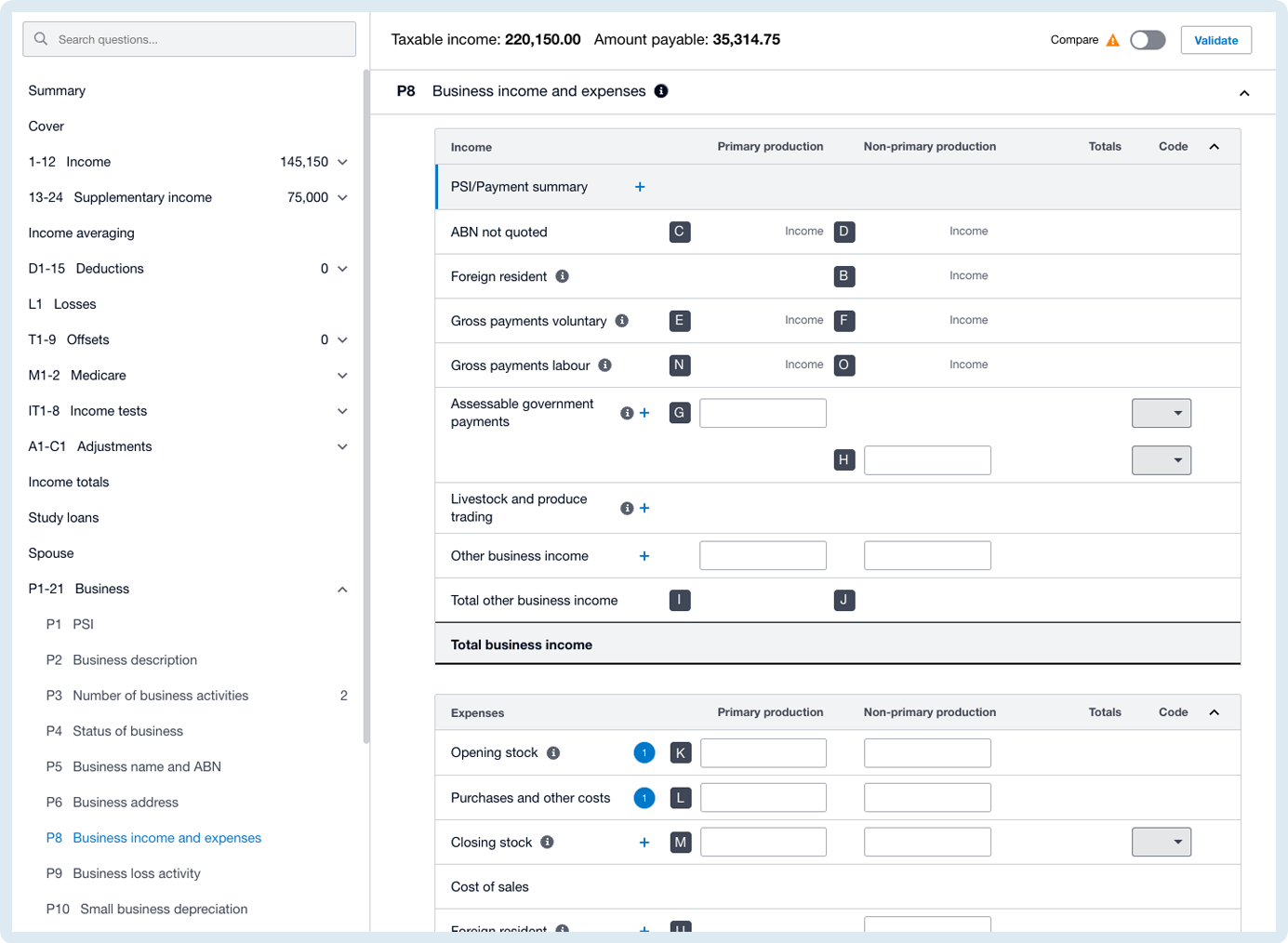
The Xero Tax app is essentially a large, information-dense, super calculator. It enables accountants and bookkeepers to manage tax preparation, lodgement and compliance tasks for their clients in Australia.
The current Xero Tax forms, while familiar to our users, have become less efficient and slower to use. This makes it harder for tax preparers to do their job during tax season, the busiest time of the year.
And just to make it interesting, we also need to evolve the designs without impacting our existing users’ current efficiency, which is built around familiarity.
THE APPROACH
We needed to get the basics right to improve performance by firstly aligning the UI to Xero's design system. We then strategically iterated and updating the existing UX to drive speed and efficacy, without introducing a whole new way of working for our users.
From research interviews we observed that Xero Tax was seen primarily as a tool. The best metaphor that we came up with was that of a hammer.

Accountants and Bookkeepers need to understand what to expect as they engage with this tool multiple times a day, repeatedly trying to hit a nail on the head as efficiently as possible.
Our challenge was to improve the grip, the weight ratio, the quality of materials that made up the hammer, in a way that made sense to our users. It was not to give them a brand-new tool to learn.

THE SOLUTION
Empathy for our users
Accountants and Bookkeepers (ABs) are a unique persona to design for.
In comparison to a more typical small business owner, ABs like a cockpit view of things, and are not afraid of density or multiple forms of content on the page. Where as designers we tend to lean towards the "less is more" approach, ABs are used to spreadsheets, tables full of numbers with many rows and columns visible at any one time.
Therein lies our challenge as designers. To listen, and think of the user foremost, and remember who we are solving this problem for.
THE SOLUTION
Make navigation great again
Refering back to my previous "cockpit" metaphor, one thing that became crystal clear in our research and testing was that ABs really, really, dislike scrolling. I remind you that they are used to rows upon rows of figures spread across multiple screens, multiple tabs, and multiple devices. They are not scared of density, and they are on high alert for anything that resembles "white space". 
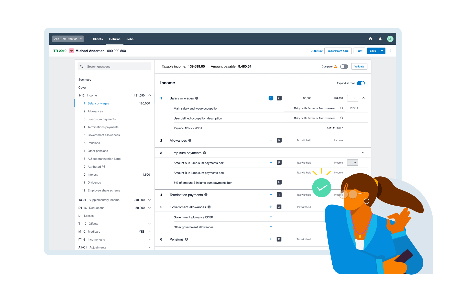
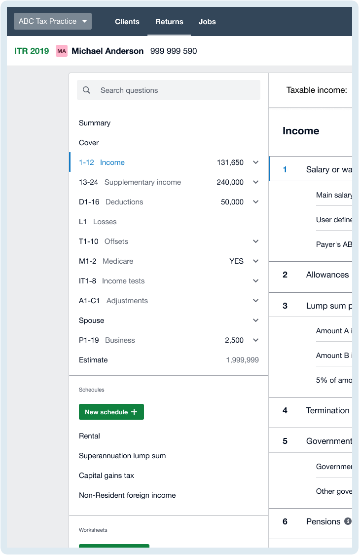
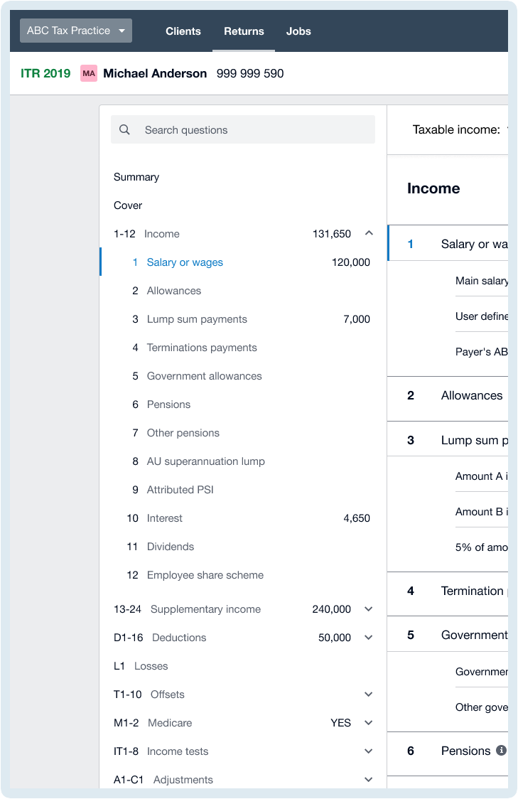
An obvious candidate to improve was the form navigation. The way the tax forms currently work is that ALL the possible questions are supplied togther from the ATO, and the AB only inputs data into the relevant section for their client. And, it's different for each client. And, the data is a mix of manual entry, pre-fill from the ATO, pre-fill from the Xero client record, and rolled-over data from the previous year's tax return. 
It's a data-fest, and previously Xero Tax had only one way of reviewing the data in each form. That was to look through every, single, section. All eleven of them. Some with up to 20-30 questions within each section.
Talk about a scroll-fest.
Finding that needle in a haystack
Through beta releases, testing and quick-fire iterations, we discovered that ABs wanted:
- To know what questions were contained within what sections
- Where data was captured within those sections
- What that data amounted to in each section
By adding transparency to what data was captured where in the form, ABs were no longer blind. They could now navigate with precision to each part of the form, see what data was captured in each section, and be able to review it accordingly.
This was of high value, not only to the tax preparers, but also to those reviewing the work. Reviews could now be done with speed and accuracy, and enable quick identification of any errors.
See the image below for the open and closed state of the navigation.
THE SOLUTION
Introducing clear hierarchy and recognisable design patterns
One of the places where we could see a clear opportunity to improve was to introduce design patterns our users interact with every day across all the other tools they use.
We didn't need to reinvent the wheel, but we did need to reduce the friction.
We replaced older, bespoke designs on tables, headings, and spacing and swapped them out with more commonly used design patterns that our users recognise. We also were growing by around 1,000 practices a year, so we had to ensure our new users were seeing a UX they understood.
Below you can use a slider to compare the previous design with what we relaunched with. 
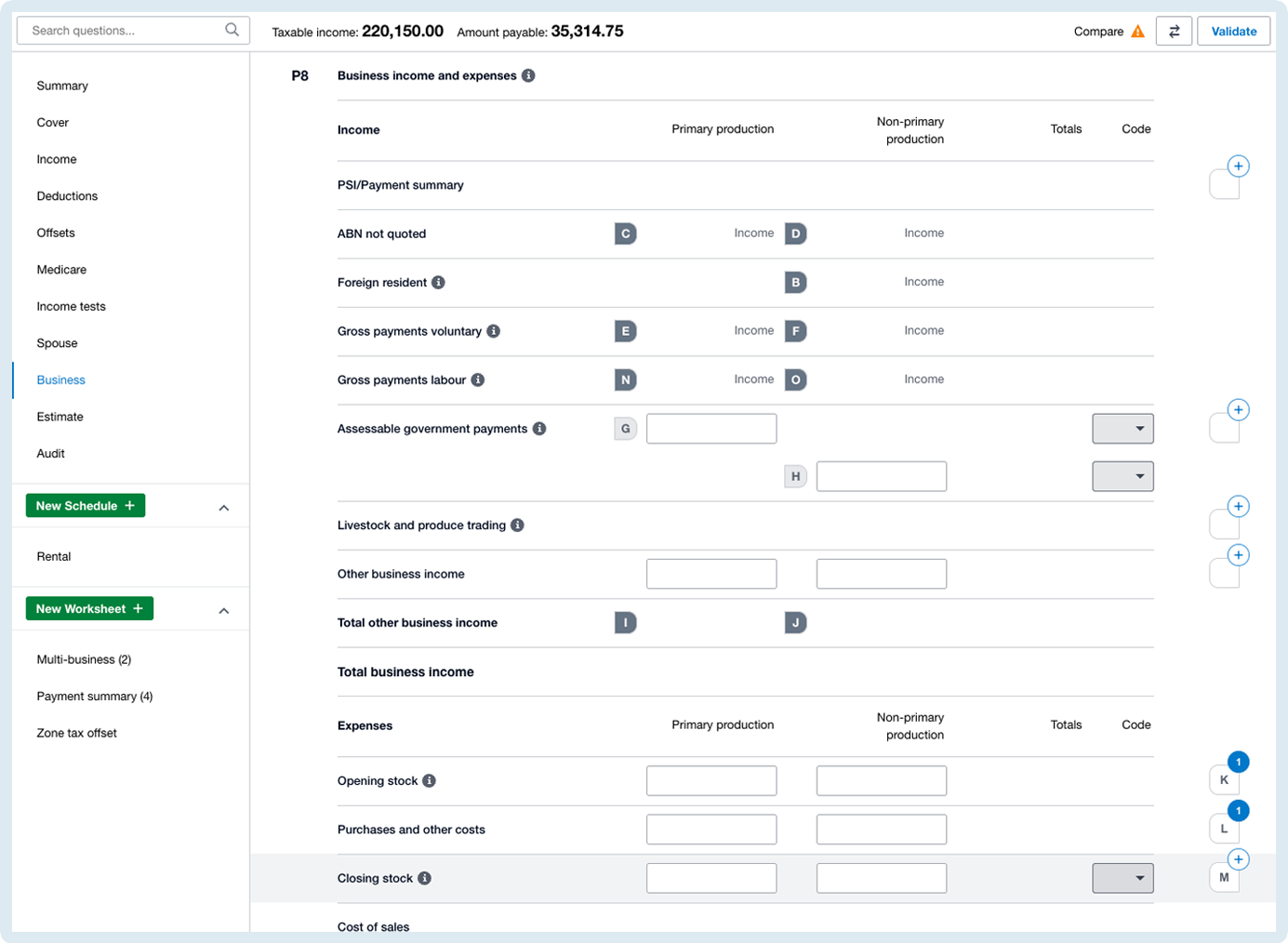
Slide the bar in the middle to the left and right to compare the designs ↔
LEARNINGS & OUTCOMES
Clear eyes, full hearts, can't lose
We interviewed 10 participants over 3 weeks who fell into 3 main user groups.
- The partners processing less than 1K returns a year
- The partners processing more than 1K returns a year
- The partners processing more than 5K returns a year
And thankfully, the response was pretty positive across all groups.
We learned a lot about having more empathy for our users, and that seeing someone use your design in a real-world situation (and sometimes in anger) is much more reliable than holding someone's hand through a prototype. ABs are a very interesting persona to design for and are actually very willing to embrace changes, as long as you can quickly illustrate the value in those changes. 
QUOTES
“...it’s more concise, more professional, added more functionality without really changing substantially what we do day in and out. I'd be pretty excited to show the team.”
"...I'm not scrolling!"
“...navigation is really improved, it’s a major improvement to be able to go straight to where I want to go.”
Note: Due to confidentiality, this is a snapshot based on shipped product and publicly available information. If you’d like to gain more insight into my role in this work , please get in touch, I'd love to have a chat
© 2026 Andy Lewis / Shapes